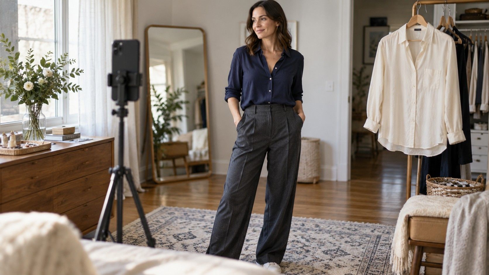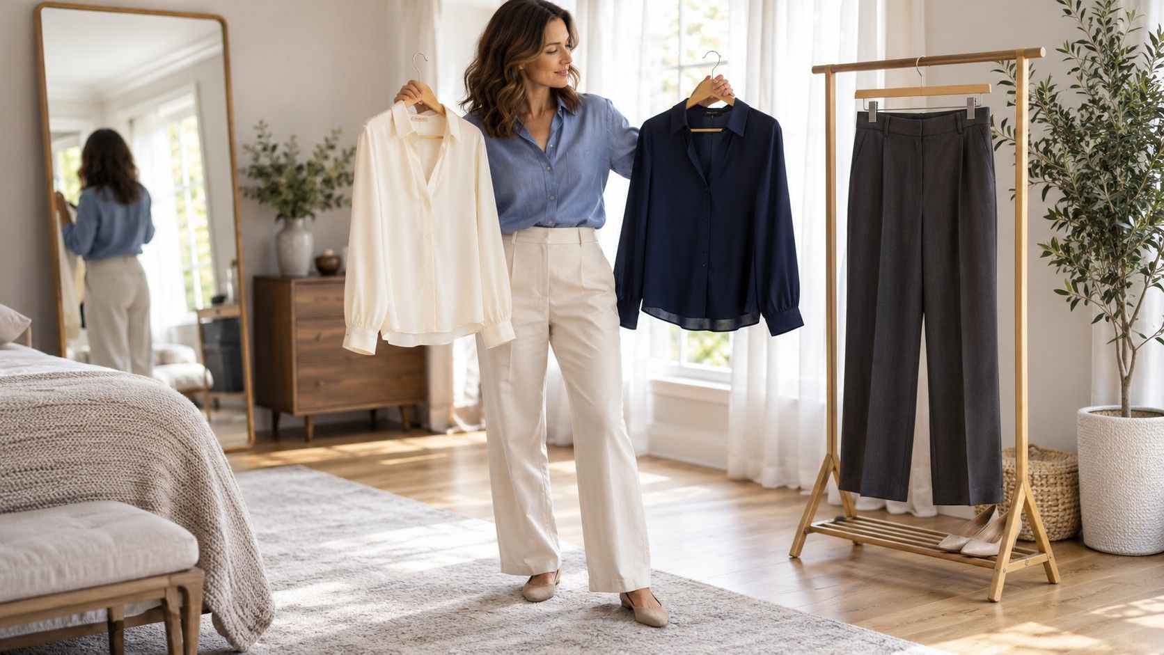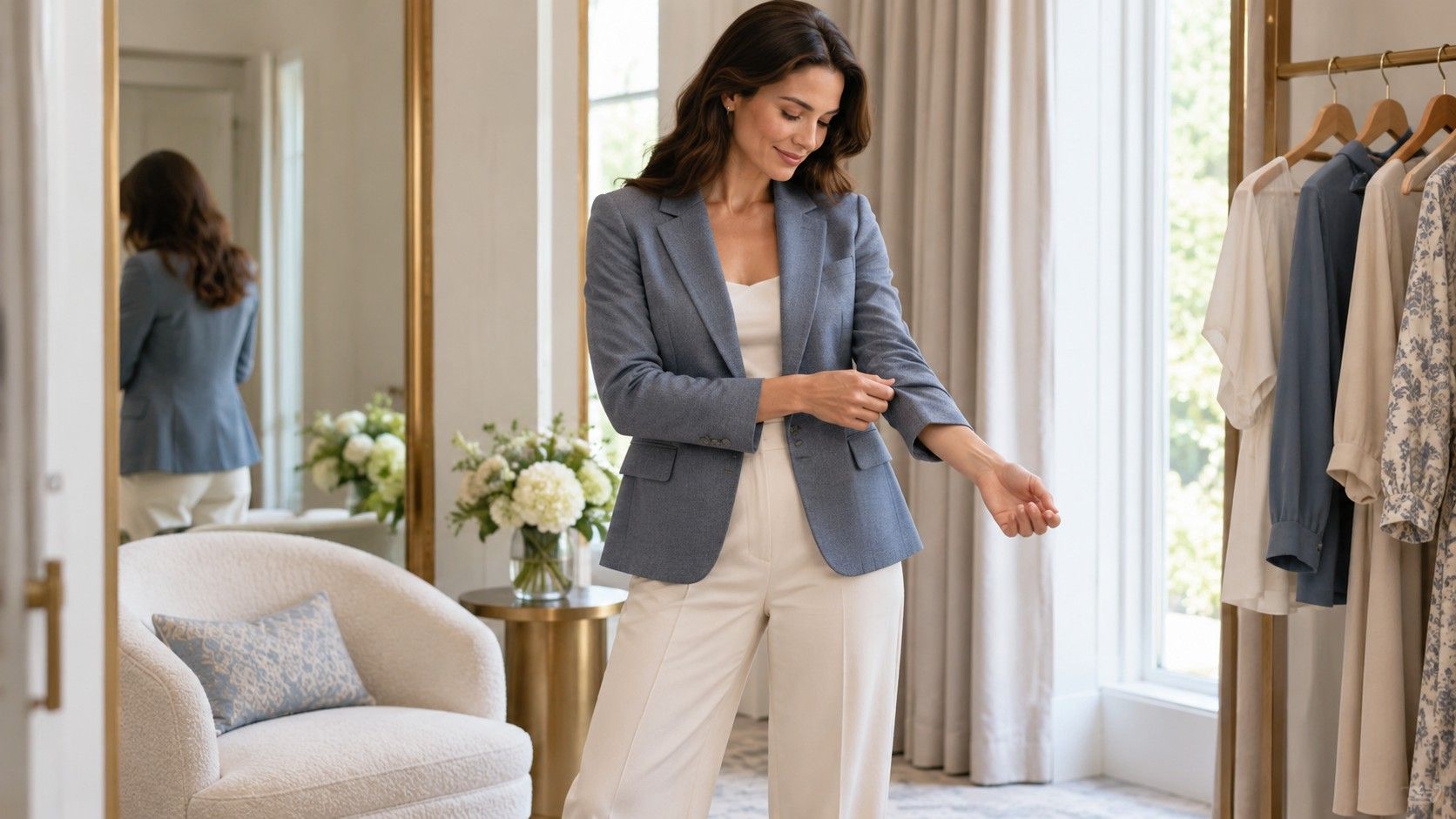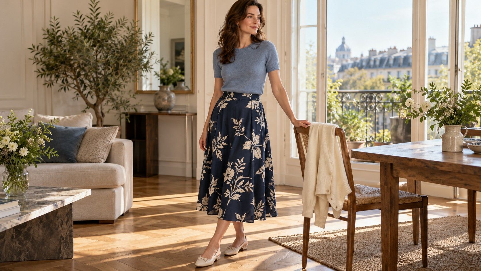
A print can look small on a product page and surprisingly busy when it covers a whole dress. Another may seem bold up close yet read as a quiet texture from across a room. Choosing between them involves more than matching the size of a flower to a body label. Look at the repeat, spacing, color contrast and garment construction together. Then try the printed piece with the shoes and layer you would actually wear. That comparison gives you a useful decision without requiring a rule about which bodies may wear which patterns.
Look at the whole repeat rather than one motif
Print scale describes the apparent size of a pattern, but a single motif tells only part of the story. A large flower surrounded by open background can feel less dense than hundreds of tiny flowers packed tightly together. A repeat is the arrangement that recurs across the fabric. Look for both the individual shapes and the rhythm created by their spacing, especially across the front of a dress or a long skirt.
Hold the garment at arm’s length, then view it from several steps away. Small dots may merge into a texture; larger spots remain separate. Ask which effect you enjoy in the complete outfit. Advice connecting print scale and body proportions can be a starting point for comparison, but it does not establish a correct size of pattern for you. Your preferred mood, the cut and the amount of printed fabric all affect the result.
Compare two pieces with similar shapes if you want to judge scale. A fitted floral shirt and an oversized checked coat differ in too many ways to isolate the print. Two similarly cut shirts make the comparison easier. Keep the base trousers and shoes the same, and look at each shirt buttoned or tucked as you intend to wear it. A different neckline can expose enough plain space to change how busy the pattern feels.
Notice the direction of the repeat too. A drifting botanical pattern has a different rhythm from a regular grid, even when its motifs are similar in size. Rotate your view to the side and back rather than judging only the center front.
Compare print contrast with the outfit palette
A small black-and-white check may be more immediately visible than a large pattern in neighboring shades of blue. Contrast therefore deserves its own comparison. Look at the difference between the darkest and lightest parts, then at the difference between colors. A print with strong light-dark changes can create a lively surface even when every motif is small. Softer color differences may make a larger motif feel more restrained.
If you use seasonal color ideas, treat them as optional references when exploring the actual fabric. A palette label cannot tell you how a print will sit beside your face, and a product’s color name may not describe it accurately. Compare in consistent light with a plain garment you already enjoy. Check whether the background color dominates from a distance or whether one bright detail keeps catching your attention.
You can repeat one color from the print elsewhere in the outfit without matching it exactly. A navy trouser under a patterned blouse may connect with dark blue marks in the fabric; a cream cardigan can echo a pale background. Alternatively, choose a familiar neutral and let the print stand apart. Lay the pieces together before dressing, then check again on your body, where folds and layers reveal different amounts of each color.
When a print feels too busy, change the visible area before rejecting it. An open plain jacket exposes a narrower section of a patterned top. A scarf shows less pattern than a full shirt. If the print still feels distracting in a smaller area, try lower contrast or wider spacing. These are distinct adjustments, and comparing one at a time helps identify what you actually prefer.
Notice what seams do to the pattern
A repeat is printed on fabric before that fabric becomes a garment. Seams, darts and gathers interrupt it, sometimes deliberately. Check the center front, side seams and any pocket that lies over a large motif. A stripe that changes direction across a yoke may be an intentional design feature; a flower cut awkwardly at a closure may simply be something you dislike. Judge the visible result rather than assuming every interruption is a fault.
Pattern placement can vary between two examples of the same style. If a large motif lands in a place you would rather leave quieter, another garment from the rail may look different. Check the back as well as the front. This is a preference about the piece you are buying, not a claim that a particular body area must be hidden. You are allowed to want a different arrangement for any reason.
Fit affects the pattern too. Checks and stripes can make pulling or twisting easier to notice. Sit, reach and walk, then observe whether the cloth settles comfortably. Some bending and distortion are normal when a garment moves. Strong tension across a fastening, discomfort or a seam that pulls persistently may warrant another size or cut. Do not choose restrictive fit solely to keep a printed line perfectly straight.
Gathered and pleated garments compress parts of the repeat, producing darker or busier areas where fabric overlaps. Hold a pleated skirt still, then take a step to see how the pattern opens. A plain photograph may miss this change. If you plan to shorten the garment, ask how removing fabric at the hem would alter a border print or large motif. The placement you like may depend on its current length.
Balance a printed garment with shoes and layers
Build the first outfit around one printed piece and familiar plain clothes. A patterned skirt with a simple knit gives you a clear starting point; add the actual shoes rather than judging the skirt in socks. A substantial boot can create a different mood from a fine sandal. Neither needs to correct the print. The useful question is whether the weight, formality and walking comfort suit the occasion you have in mind.
Put the coat or jacket on early in the comparison. A printed sleeve may show beyond a cuff, or the hem of a dress may create a wide band below a shorter layer. Check whether you enjoy those visible sections. The combination matters particularly when a commute or outdoor event means you will wear the layer for much of the day. An outfit that only works once the coat comes off may be less versatile than you expect.
Accessories introduce more lines and surfaces. A bag strap can cross a large motif; a necklace may disappear into a dense pattern or add another focal point. Try the outfit with fewer accessories first, then add the item you actually need. If you enjoy mixing prints, begin with a common color or a clear difference in scale, and check the result from a distance. That is an experiment, not a requirement for success.
Compare a tucked and untucked version if the garment allows both. Tucking changes the amount of visible print and where its lower edge meets the rest of the outfit. An open layer can change that edge again. Take a quick full-length photo to remember a combination you like, including shoes and bag. It is easier to recreate a specific arrangement than to remember an abstract instruction about balance.
Choose the print that survives an ordinary day
A print still needs a wearable fabric and a practical cut. Check opacity in normal light, how the garment feels against your skin and whether the care instructions fit your routine. A pattern you love may be worth special care for an occasional dress; a daily work shirt needs to fit the time you can give it. The design on the surface does not remove those ordinary requirements.
For an online purchase, look for views showing the whole garment, close details and the back. A cropped image may hide the repeat size, hem border or placement at seams. Check the return conditions before ordering when those details matter to you. On arrival, assess the actual piece with tags attached according to the seller’s rules. Photography, lighting and pattern placement can all make it different from the version you expected.
Wear an existing printed piece for a normal activity before buying something similar. Note whether you enjoy the pattern all day, whether it works under your layer and whether it combines with more than one base. You may find that the print itself is pleasing but the sleeves are inconvenient, or that the fabric works well and the contrast feels stronger than you want. Keep these observations separate so the next choice is more precise.
The most useful outcome is a description you can repeat: widely spaced motifs, a dark background, moderate contrast and a neckline that works beneath your coat, for example. You do not need to assign those preferences to a permanent body category. Choose the print whose construction, color and everyday behavior work together, and keep room for a different pattern when the outfit or occasion changes.